
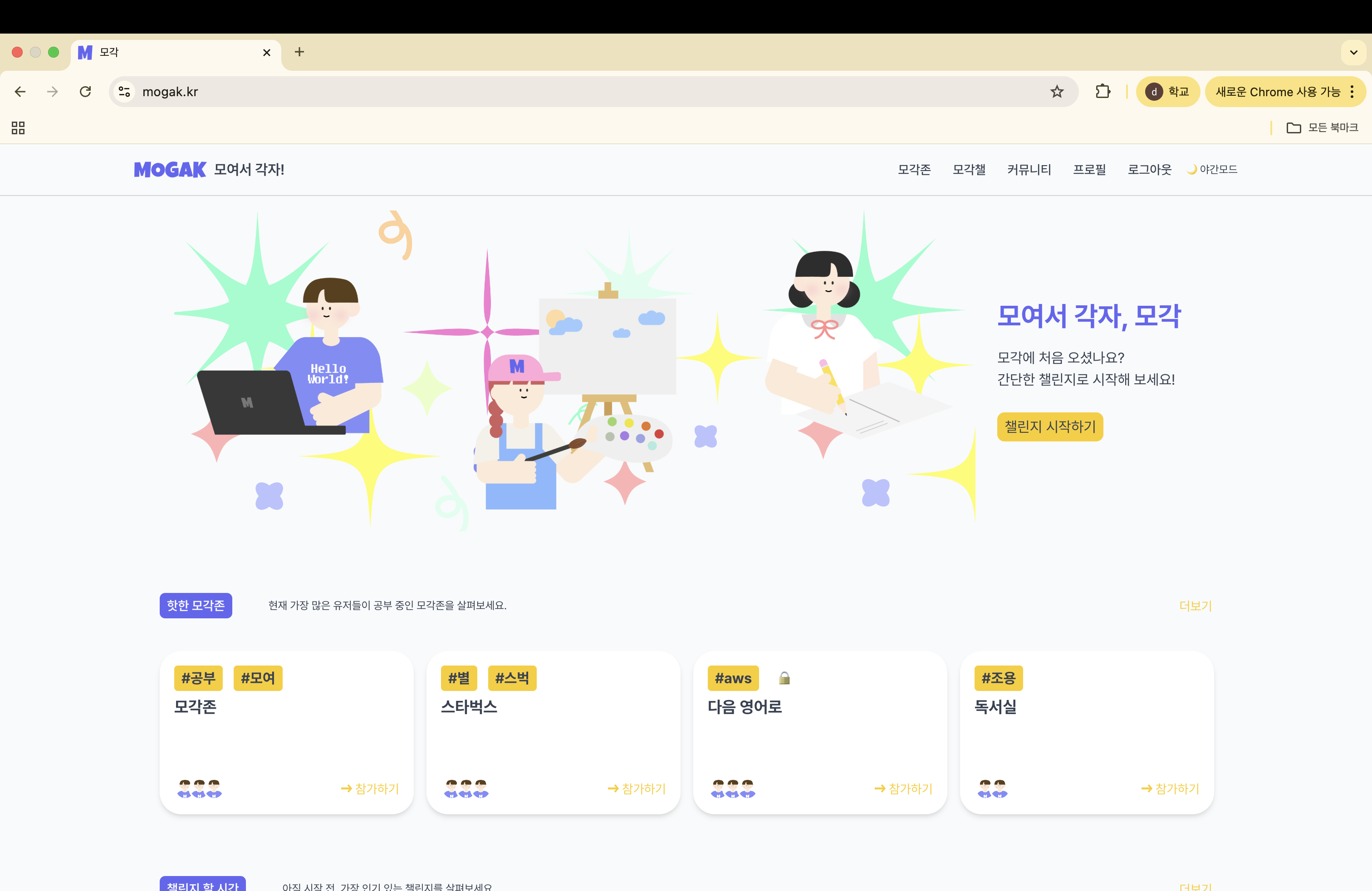
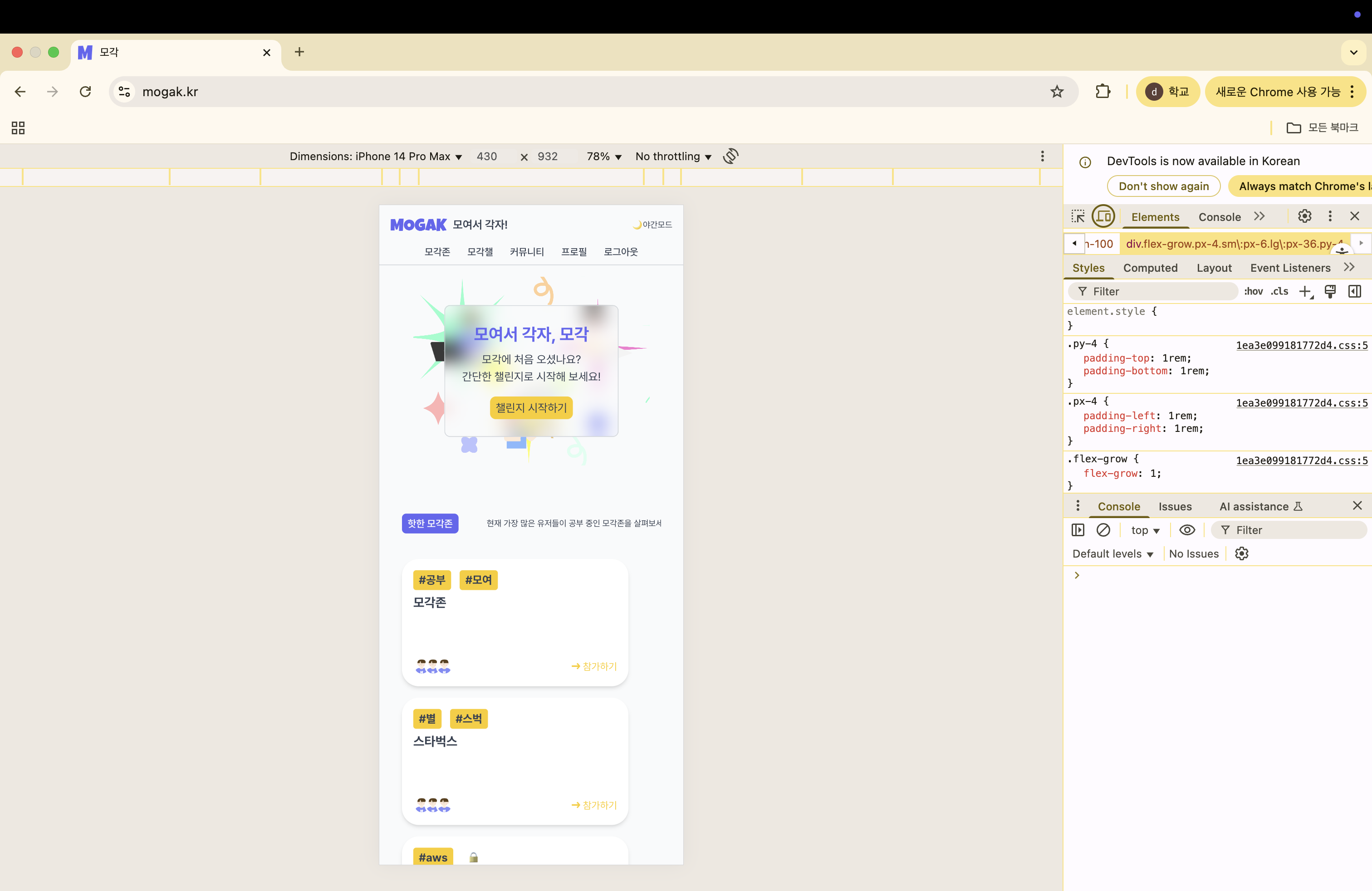
첫 진입시 출력되는 홈 화면으로, 모바일 대응 반응형도 구현했다.
"모여서 각자 공부하기" 라는 콘셉트를 보여 줄 수 있는 이미지를 위해 다양한 공부 및 작업하는 캐릭터를 삽입했다.
캐릭터 디자인은 디자이너 지인이 도와주었습니다 https://www.youtube.com/@티거-r9c
Next.js 의 장점, 서버 사이드 렌더링을 최대한 살리기 위해 메인은 당연히 server component 여야 한다고 생각했다.
그렇지만 모각존과 모각챌은 참여자가 많은 순으로 소개하는 기능이므로
실시간까지는 아니더라도 길지 않은 텀으로 업데이트되어야 할 것 같아 revalidate 를 10분으로 설정했다.
export async function MainZoneChallenge() {
  const res = await fetch(`${process.env.BACKEND_API_URL}`, {
    next: { revalidate: 60 * 10 },
  });

  if (!res.ok) {
    const err = await res.text();
    console.error("서버 응답:", err);
    throw new Error(`메인 불러오기 실패: ${res.status}`);
  }

  const data: MainResponse = await res.json();

  return data;
}
또한 이전 프로젝트에서 느꼈던 큰 문제점 중 하나인, "react 의 가장 큰 장점인 component 화를 살리지 못하고 있어 가독성 및 효율이 떨어짐" 을 개선하기 위해 메인에서 사용하는 ImageCard section 도 component 로 분리하여 props 로 값을 넘기는 방식을 사용했다.
 <ImageCard
          type="home"
          title="모여서 각자, 모각"
          description1="모각에 처음 오셨나요?"
          description2="간단한 챌린지로 시작해 보세요!"
          button="챌린지 시작하기"
          buttonUrl="/challenge"
          img1={student.src}
          img2={coding.src}
          img3={designer.src}
          bgImageLight={MainBgLight.src}
          bgImageDark={MainBgDark.src}
        />
"use client";
import Link from "next/link";
import Button from "../ui/button";
import { ImageCardProps } from "@/types/shared.type";
export default function ImageCard({
title,
description1,
description2,
button,
buttonUrl,
img1,
img2,
img3,
bgImageLight,
bgImageDark,
}: ImageCardProps) {
return (
<div className="flex justify-center w-full px-4">
<div className="relative w-full max-w-7xl flex flex-col lg:flex-row items-center gap-6">
<div
className="relative w-full lg:w-4/5 aspect-[5/4] sm:aspect-[5/3] md:aspect-[5/2] bg-cover bg-left rounded-lg overflow-hidden"
style={{ backgroundImage: `url(${bgImageLight})` }}
>
<div
className="hidden dark:block absolute inset-0 z-0"
style={{
backgroundImage: `url(${bgImageDark})`,
backgroundSize: "cover",
backgroundPosition: "left",
}}
/>
{img1 && (
<img
src={img1}
alt="img1"
className="absolute top-10 right-6 w-20 sm:w-40 lg:w-52 z-10"
/>
)}
{img2 && (
<img
src={img2}
alt="img2"
className="absolute top-10 left-6 w-20 sm:w-40 lg:w-52 z-10"
/>
)}
{img3 && (
<img
src={img3}
alt="img3"
className="absolute bottom-6 left-1/2 transform -translate-x-1/2 w-20 sm:w-40 lg:w-56 z-10"
/>
)}
<div className="absolute inset-0 flex items-center justify-center lg:hidden z-10">
<div className="backdrop-blur-md border border-borders text-gray-900 text-center p-6 rounded-lg max-w-md">
<h2 className="text-2xl sm:text-3xl text-primary dark:text-primary-dark font-bold">
{title}
</h2>
<div className="text-base text-text dark:text-borders sm:text-lg mt-2">
<p>{description1}</p>
{description2 && <p>{description2}</p>}
</div>
<Link href={buttonUrl}>
<Button variant="secondary" className="mt-4">
{button}
</Button>
</Link>
</div>
</div>
</div>
<div className="hidden lg:flex flex-col justify-center gap-4 lg:w-1/5">
<h2 className="text-3xl font-bold text-primary">{title}</h2>
<div className="text-base text-gray-700 dark:text-gray-300">
<p>{description1}</p>
{description2 && <p>{description2}</p>}
</div>
<Link href={buttonUrl}>
<Button variant="secondary">{button}</Button>
</Link>
</div>
</div>
</div>
);
}
'Dazz6 > ABOUT' 카테고리의 다른 글
| 모각 프로젝트 - #2-3. 모각챌 (0) | 2025.08.03 |
|---|---|
| 모각 프로젝트 - #2-2. 모각존 (0) | 2025.08.02 |
| 모각 프로젝트 - #1. 소개 (2) | 2025.07.31 |
| 고마워써 프로젝트 - #3. 배포 및 회고 (0) | 2025.01.17 |
| 고마워써 프로젝트 - #2-9. 작성하기 (0) | 2025.01.16 |